
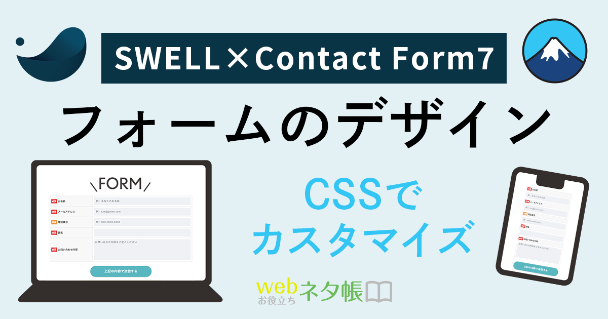
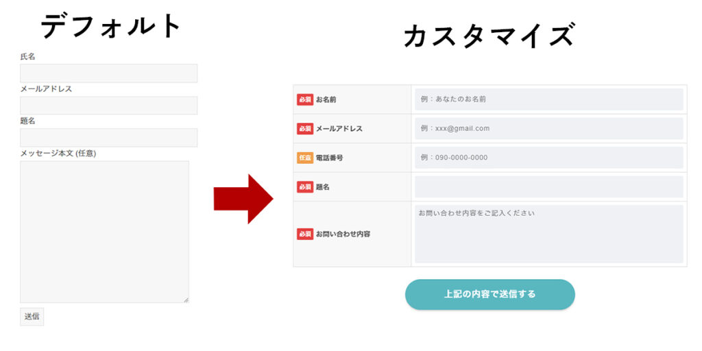
SWELLで「Contact From 7」を利用すると、デフォルトだとシンプルなのでカスタマイズをしてみました。
目次
Contact Form 7 カスタマイズ方法
サンプルイメージ
demo_mode: on上記フォームはデモモードのため、ボタンを押しても送信されません。
HTML
まずはContact Form 7 のフォームを変更します。
管理画面より「お問い合わせ」>「コンタクトフォーム」から変更したいフォームを選択し、タブの「フォーム」にこちらを貼り付けます。
<table class="inquiry">
  <tr>
    <th><span class="req">必須</span><label>お名前</label></th>
    <td>[text* your-name autocomplete:name placeholder "例:あなたのお名前"]</td>
  </tr>
  <tr>
    <th><span class="req">必須</span><label>メールアドレス</label></th>
    <td>[email* your-email autocomplete:email placeholder "例:xxx@gmail.com"]</td>
  </tr>
  <tr>
    <th><span class="any">任意</span><label>電話番号</label></th>
    <td>[tel your-tel placeholder "例:090-0000-0000"]</td>
  </tr>
  <tr>
    <th><span class="req">必須</span><label>題名</label></th>
    <td>[text* your-subject]</td>
  </tr>
  <tr>
    <th><span class="req">必須</span><label>お問い合わせ内容</label> </th>
    <td>[textarea* your-message placeholder "お問い合わせ内容をご記入ください"]</td>
  </tr>
</table>
[response]
<div class="text-center">[submit "上記の内容で送信する"]</div>[response]を記述すると、エラーメッセージの配置を変更できます。
※何も書かなければ、ボタンの下あたりに表示されます。
CSS
固定ページのフォームを表示しているページ内の「カスタムCSS&JS」の「CSS用コード」にカスタマイズ用のCSSを追加します。
input[type="text"],
input[type="email"],
input[type="tel"],
select,
textarea{
  display: block;
  width: 100%;
  height: 45px;
  margin-bottom: 0;
  padding: 0 12px;
  border: 0;
  border-radius: 3px;
  background-color: #eff1f5;
  box-shadow: none;
  color: #5c6b80;
  font-size: 1em;
  vertical-align: middle;
  line-height: 45px;
}
textarea {
  max-width: 100%;
  min-height: 120px;
  line-height: 1.5em;
  padding: 0.8em;
  overflow: auto;
}
@media(max-width:599px) {
  .inquiry td,
  .inquiry th {
    display: block !important;
    width: 100% !important;
    border-top: none !important;
    -webkit-box-sizing: border-box !important;
    -moz-box-sizing: border-box !important;
    box-sizing: border-box !important;
  }
  .inquiry tr:first-child th {
    border-top: 1px solid #ddd !important;
  }
}
.inquiry th {
  text-align: left;
  font-size: 14px;
  color: #444;
  padding-right: 5px;
  width: 30%;
  background: #f8f8f8;
  border: solid 1px #ddd;
}
.inquiry td {
  font-size: 14px;
  border: solid 1px #ddd;
}
.req { /* 必須 */
  font-size: 12px;
  padding: 5px;
  background: #e44141;
  color: #fff;
  border-radius: 2px;
  margin-right: 5px;
  position: relative;
  bottom: 1px;
}
.any { /* 任意 */
  font-size: 12px;
  padding: 5px;
  background: #f09f4d;
  color: #fff;
  border-radius: 2px;
  margin-right: 5px;
  position: relative;
  bottom: 1px;
}
.verticallist .wpcf7-list-item {
  display: block;
}
th {
  font-weight: 700;
  text-transform: uppercase;
  padding: 13px;
}
td {
  border-top: 1px solid #ededed;
  padding: 12px;
}
input,
select,
textarea {
  letter-spacing: 1px;
  margin: 0;
  max-width: 100%;
  resize: none;
}
.text-center{
  text-align:center;
}
.wpcf7-submit {
  display: block;
  border: none;
  width: 350px;
  margin: 25px auto 0;
  padding: 15px;
  cursor: pointer;
  font-size: 18px;
  background-color: var(--color_main);
  color: #fff;
  font-weight: 700;
  border-radius: 50px;
  box-shadow: var(--swl-btn_shadow);
  transition: box-shadow .25s;
}
.wpcf7-submit:hover {
  box-shadow: 0 4px 12px rgb(0 0 0 / 10%), 0 12px 24px -12px rgb(0 0 0 / 20%);
  opacity: 1;
}| CSS変数名 | 色 |
|---|---|
--color_main | SWELLのテーマカラー |
レスポンスメッセージのCSS
エラーメッセージなどが表示されるCSSです。なくても大丈夫です。合わせて入れておくと色など修正しやすいです。
.wpcf7 form .wpcf7-response-output {
  margin: 2em 0.5em 1em;
  padding: 1em;
  border-radius: 0.25rem;
  border: 2px solid #00a0d2; /* Blue */
}
.wpcf7 form.init .wpcf7-response-output {
  display: none;
}
.wpcf7 form.sent .wpcf7-response-output {
  border-color: #46b450; /* Green */
}
.wpcf7 form.failed .wpcf7-response-output,
.wpcf7 form.aborted .wpcf7-response-output {
  border-color: #dc3232; /* Red */
}
.wpcf7 form.spam .wpcf7-response-output {
  border-color: #f56e28; /* Orange */
}
.wpcf7 form.invalid .wpcf7-response-output,
.wpcf7 form.unaccepted .wpcf7-response-output {
  border-color: #ffb900; /* Yellow */
}
WordPressおすすめテーマ!SWELL
- 簡単に綺麗なブログが作れる!
- 企業サイトにも良さそう!
- メンテナンスが楽
- 表示速度も速い!
- サブスクではないので一度購入すればOK!