
Bootstrap4ではフレックスボックスFlexboxが使えるようになりました。
目次
Flex動作を有効にする
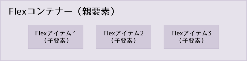
まずは、d-flexまたはd-inline-flexクラスを設定し、Flexコンテナーを作成します。
d-flex
デフォルトのFlexコンテナー
<div class="d-flex p-2 bd-highlight">デフォルトのFlexコンテナ</div>d-inline-flex
インラインのFlexコンテナー
<div class="d-inline-flex p-2 bd-highlight">インラインのFlexコンテナ</div>レスポンシブ対応サイズ
| デフォルトFlexコンテナー | インラインFlexコンテナー | |
|---|---|---|
| 全て | .d-flex | .d-inline-flex |
| 576px以上 | .d-sm-flex | .d-sm-inline-flex |
| 768px以上 | .d-md-flex | .d-md-inline-flex |
| 992px以上 | .d-lg-flex | .d-lg-inline-flex |
| 1200px以上 | .d-xl-flex | .d-xl-inline-flex |
方向の設定(横並び、縦並び)
Flexboxの方向(横並び、縦並び)を指定します。(デフォルトflex-row)
横並び flex-row、flex-row-reverse
横並びにするには .flex-rowを使用し、反対側からは .flex-row-reverse を使用します。
左から設定.flex-row
Flexアイテム1
Flexアイテム2
Flexアイテム3
<div class="d-flex flex-row bd-highlight mb-3">
  <div class="p-2 bd-highlight">Flexアイテム1</div>
  <div class="p-2 bd-highlight">Flexアイテム2</div>
  <div class="p-2 bd-highlight">Flexアイテム3</div>
</div>右から設定.flex-row-reverse
Flexアイテム1
Flexアイテム2
Flexアイテム3
<div class="d-flex flex-row-reverse bd-highlight">
  <div class="p-2 bd-highlight">Flexアイテム1</div>
  <div class="p-2 bd-highlight">Flexアイテム2</div>
  <div class="p-2 bd-highlight">Flexアイテム3</div>
</div>
縦並び flex-column、flex-column-reverse
縦並びにするには .flex-columnを使用し、反対側からは .flex-column-reverse を使用します。
上から設定.flex-column
Flexアイテム1
Flexアイテム2
Flexアイテム3
<div class="d-flex flex-column bd-highlight mb-3">
  <div class="p-2 bd-highlight">Flexアイテム1</div>
  <div class="p-2 bd-highlight">Flexアイテム2</div>
  <div class="p-2 bd-highlight">Flexアイテム3</div>
</div>下から設定.flex-column-reverse
Flexアイテム1
Flexアイテム2
Flexアイテム3
<div class="d-flex flex-column-reverse bd-highlight">
  <div class="p-2 bd-highlight">Flexアイテム1</div>
  <div class="p-2 bd-highlight">Flexアイテム2</div>
  <div class="p-2 bd-highlight">Flexアイテム3</div>
</div>
レスポンシブ対応サイズ
| 左から設定 | 右から設定 | 上から設定 | 下から設定 | |
|---|---|---|---|---|
| 全て | .flex-row | .flex-row-reverse | .flex-column | .flex-column-reverse |
| 576px以上 | .flex-sm-row | .flex-sm-row-reverse | .flex-sm-column | .flex-sm-column-reverse |
| 768px以上 | .flex-md-row | .flex-md-row-reverse | .flex-md-column | .flex-md-column-reverse |
| 992px以上 | .flex-lg-row | .flex-lg-row-reverse | .flex-lg-column | .flex-lg-column-reverse |
| 1200px以上 | .flex-xl-row | .flex-xl-row-reverse | .flex-xl-column | .flex-xl-column-reverse |
横方向の整列 justify-content-***
横方向の整列は、justify-content-***クラスのstart(デフォルト)、end、center、between、aroundを選択することで配置を指定することができます。
左寄せ.justify-content-start
Flexアイテム
Flexアイテム
Flexアイテム
<div class="d-flex justify-content-start">...</div>右寄せ.justify-content-end
Flexアイテム
Flexアイテム
Flexアイテム
<div class="d-flex justify-content-end">...</div>左右中央揃え.justify-content-center
Flexアイテム
Flexアイテム
Flexアイテム
<div class="d-flex justify-content-center">...</div>両端から均等に並列.justify-content-between
Flexアイテム
Flexアイテム
Flexアイテム
<div class="d-flex justify-content-between">...</div>等間隔に並列.justify-content-around
Flexアイテム
Flexアイテム
Flexアイテム
<div class="d-flex justify-content-around">...</div>レスポンシブ対応サイズ
| 左寄せ | 右寄せ | 左右中央揃え | 両端から均等に並列 | 等間隔に並列 | |
|---|---|---|---|---|---|
| 全て | .justify-content-start | .justify-content-end | .justify-content-center | .justify-content-between | .justify-content-around |
| 576px以上 | .justify-content-sm-start | .justify-content-sm-end | .justify-content-sm-center | .justify-content-sm-between | .justify-content-sm-around |
| 768px以上 | .justify-content-md-start | .justify-content-md-end | .justify-content-md-center | .justify-content-md-between | .justify-content-md-around |
| 992px以上 | .justify-content-lg-start | .justify-content-lg-end | .justify-content-lg-center | .justify-content-lg-between | .justify-content-lg-around |
| 1200px以上 | .justify-content-xl-start | .justify-content-xl-end | .justify-content-xl-center | .justify-content-xl-between | .justify-content-xl-around |
縦方向の整列 align-items-***
縦方向の整列は、align-items-***クラスのstart、end、center、baseline、stretch(デフォルト)を選択することで配置を指定することができます。
上揃え.align-items-start
Flexアイテム
Flexアイテム
Flexアイテム
<div class="d-flex align-items-start">...</div>下揃え.align-items-end
Flexアイテム
Flexアイテム
Flexアイテム
<div class="d-flex align-items-end">...</div>上下中央揃え.align-items-center
Flexアイテム
Flexアイテム
Flexアイテム
<div class="d-flex align-items-center">...</div>ベースライン揃え.align-items-baseline
Flexアイテム
Flexアイテム
Flexアイテム
<div class="d-flex align-items-baseline">...</div>コンテナいっぱいに伸ばす.align-items-stretch
Flexアイテム
Flexアイテム
Flexアイテム
<div class="d-flex align-items-stretch">...</div>レスポンシブ対応サイズ
| 上揃え | 下揃え | 上下中央揃え | ベースライン揃え | コンテナいっぱいに伸ばす | |
|---|---|---|---|---|---|
| 全て | .align-items-start | .align-items-end | .align-items-center | .align-items-baseline | .align-items-stretch |
| 576px以上 | .align-items-sm-start | .align-items-sm-end | .align-items-sm-center | .align-items-sm-center | .align-items-sm-stretch |
| 768px以上 | .align-items-md-start | .align-items-md-end | .align-items-md-center | .align-items-md-center | .align-items-md-stretch |
| 992px以上 | .align-items-lg-start | .align-items-lg-end | .align-items-lg-center | .align-items-lg-center | .align-items-lg-stretch |
| 1200px以上 | .align-items-xl-start | .align-items-xl-end | .align-items-xl-center | .align-items-xl-center | .align-items-xl-stretch |
アイテム単位の整列(縦方向)align-self-***
アイテムに対してalign-self-***クラスのstart、end、center、baseline、stretch(デフォルト)を選択することで、個別に整列を指定できます。
上揃え.align-self-start
Flexアイテム
align Flexアイテム
Flexアイテム
<div class="align-self-start">align flexアイテム</div>下揃え.align-self-end
Flexアイテム
align Flexアイテム
Flexアイテム
<div class="align-self-end">align Flexアイテム</div>上下中央揃え.align-self-center
Flexアイテム
align Flexアイテム
Flexアイテム
<div class="align-self-center">align Flexアイテム</div>ベースライン揃え.align-self-baseline
Flexアイテム
align Flexアイテム
Flexアイテム
<div class="align-self-baseline">align Flexアイテム</div>コンテナいっぱいに伸ばす.align-self-stretch
Flexアイテム
align Flexアイテム
Flexアイテム
<div class="align-self-stretch">align Flexアイテム</div>レスポンシブ対応サイズ
| 上揃え | 下揃え | 上下中央揃え | ベースライン揃え | コンテナいっぱいに伸ばす | |
|---|---|---|---|---|---|
| 全て | .align-self-start | .align-self-end | .align-self-center | .align-self-baseline | .align-self-stretch |
| 576px以上 | .align-self-sm-start | .align-self-sm-end | .align-self-sm-center | .align-self-sm-center | .align-self-sm-stretch |
| 768px以上 | .align-self-md-start | .align-self-md-end | .align-self-md-center | .align-self-md-center | .align-self-md-stretch |
| 992px以上 | .align-self-lg-start | .align-self-lg-end | .align-self-lg-center | .align-self-lg-center | .align-self-lg-stretch |
| 1200px以上 | .align-self-xl-start | .align-self-xl-end | .align-self-xl-center | .align-self-xl-center | .align-self-xl-stretch |